Note
Access to this page requires authorization. You can try signing in or changing directories.
Access to this page requires authorization. You can try changing directories.
Applies to:  External tenants (learn more)
Important
Branding themes for applications are currently in PREVIEW. This information relates to a prerelease product that might be substantially modified before it's released. Microsoft makes no warranties, expressed or implied, with respect to the information provided here.
You can create unique authentication experiences for applications in your tenant. Each application can have its own theme that you can customize with a background image or color, favicon, layout, header, and footer. This customization overrides any configurations made to the default branding. If you don't make any changes to the elements, the default elements are displayed.
This article describes how you can create multiple branding themes for different applications in your tenant.
Prerequisites
- Have at least the Organizational Branding Administrator role.
- Have at least the Application Administrator role for applications that you want to apply a theme to.
- A registered application in your tenant. If you haven't registered an application yet, see Register an application.
- Review the file size requirements for each image you want to add. Use a photo editor if needed to create correctly sized and formatted images: PNG, JPG, or JPEG with image size 245x36px and maximum file size 10KB.
Branding theme properties
When you create a branding theme, here are some of the properties you can customize.

| Property | Description |
|---|---|
| Favicon | Small icon that appears on the left side of the browser tab. |
| Header | Space across the top of the sign-in page, behind the header log. |
| Header logo | Logo that appears in the upper-left corner of the sign-in page. |
| Background image | The entire space behind the sign-in box. |
| Page background color | The entire space behind the sign-in box. |
| Banner logo | Logo that appears at the top of the sign-in box |
| Sign-in page title | Larger text that appears below the banner logo. |
| Sign-in page description | Text to describe the sign-in page. |
| Username hint and text | The text that appears before a user enters their information. |
| Sign-in display message box | Text you can add below the username field. |
| Footer link: Privacy & Cookies | Link you can add to the lower-right corner for privacy information. |
| Footer: Terms of Use | Text in the lower-right corner of the page where you can add Terms of use information. |
| Footer | Space across the bottom of the page for privacy and Terms of Use information. |
| Template | The layout of the page and sign-in boxes. |
How branding themes work
Branding themes build on neutral branding and default branding.
- Branding theme - Customizations of the default branding where you can have multiple themes.
- Default branding (company branding) - Customizations of the neutral branding for a tenant.
- Neutral branding - Initial branding for a tenant.
Here are some important things to know about how branding themes work.
- Branding themes can be applied to specific applications, while default branding applies tenant-wide.
- Default branding is used as fallback for any properties not defined in the branding theme.
- Neutral branding is used for any properties not defined in default branding.
Limits and constraints
Here are some of the limits and constraints for branding themes.
- You can create up to 5 branding themes per tenant.
- The live preview capability previews style and layout changes and only shows the Sign in page. Live preview doesn't include any custom text overrides.
- You can't use the name Default theme for your branding theme name. This name is reserved.
- Custom text changes are currently limited to sign-in page only.
- If you don't update the banner logo property, the Microsoft logo is displayed instead of the tenant name (neutral branding).
Create a new theme
Sign in to the Microsoft Entra admin center as Organizational Branding Administrator and Application Administrator.
Browse to Entra ID > Custom branding.
On the Company branding page, select Branding themes and then select the Themes tab.

Select Create new theme.
On the Basics tab, enter a Name for your theme.
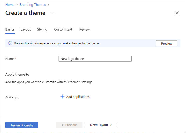
To select the applications that will use this theme, under Apply theme to, select Add applications. (Or you can add applications later.)
On the Layout tab, select the placement of web page elements on the sign-in page.
- Layout template – Choose whether the sign-in pane is centre-aligned on the page or right-aligned.
- Header – To show an image in a page header, select the checkbox and browse for the image you want to display. Requirements: Transparent PNG, JPG, or JPEG with image size 245x36px and maximum file size 10KB.
- Footer – To show a page footer that includes links to your published privacy and cookies and/or terms of use statements, select the appropriate checkbox, enter the link text, and add the URL for your content.

Select the Preview button to see your changes to the layout.

On the Styling tab, modify any of the background elements.
- Background color – The color that replaces the background image whenever the image can't be loaded, for example due to connection latency.
- Background image – The large image that displays on the sign-in page. If you upload an image, it scales and crops to fill the browser window.
- Favicon – The icon that displays in the web browser tab.
- Banner logo – Displays on the sign-in page and in the user's access panel.
- Square logo (light theme) – Represents user accounts in your tenant.
- Square logo (dark theme) – If the light theme square logo displays poorly on dark backgrounds, you can upload a logo to be used in its place when dark backgrounds are used.
- Custom CSS – Upload your own CSS file to replace default Microsoft styling with your own styling for: color, font, text size, position of elements, and displays for different devices and screen sizes. For more information, see CSS template reference guide.

Select the Preview button to see your styling changes.

On the Custom text tab, for the Sign-in page, select the Default link.

Customize the text for the selected page and then select Add.
Custom text set for a theme might impact localized UX as they will not be localized. To ensure full localization of all text, set custom text for each theme language.

On the Review tab, review your settings.
Select Create to create the theme.


Apply a theme to applications
In this section, you apply a theme to applications in your tenant.
On the Branding Themes page, select the Themes tab.
Select a theme you created to open the overview.
Under Basics, select the pencil edit icon.

Under Apply theme to, select Edit to edit the list of applications.

Search for or browse to your application. Select the check box, and then choose Select.


Edit a theme
In this section, you edit a theme.
On the Branding Themes page, select the Themes tab.
Select a theme you created to open the overview.
Select the pencil edit icon of the parts you want to edit.
Add a language to a theme
In this section, you add a language to a theme.
On the Branding Themes page, select the Themes tab.
Select a theme you created to open the overview.
On the Languages tab, select Add a language to customize the language of the theme.
The steps for customizing the language are similar to customizing branding theme.

On the Basics tab, select a language.

The following languages are supported:
- Arabic (Saudi Arabia)
- Basque (Basque)
- Bulgarian (Bulgaria)
- Catalan (Catalan)
- Chinese (China)
- Chinese (Hong Kong SAR)
- Croatian (Croatia)
- Czech (Czechia)
- Danish (Denmark)
- Dutch (Netherlands)
- English (United States)
- Estonian (Estonia)
- Finnish (Finland)
- French (France)
- Galician (Galician)
- German (Germany)
- Greek (Greece)
- Hebrew (Israel)
- Hungarian (Hungary)
- Italian (Italy)
- Japanese (Japan)
- Kazakh (Kazakhstan)
- Korean (Korea)
- Latvian (Latvia)
- Lithuanian (Lithuania)
- Norwegian Bokmål (Norway)
- Polish (Poland)
- Portuguese (Brazil)
- Portuguese (Portugal)
- Romanian (Romania)
- Russian (Russia)
- Serbian (Latin, Serbia)
- Slovak (Slovakia)
- Slovenian (Slovenia)
- Spanish (Spain)
- Swedish (Sweden)
- Thai (Thailand)
- Turkish (Türkiye)
- Ukrainian (Ukraine)
Customize the elements on the Layout, Styling, and Custom text tabs.
On the Review tab, select Add to add the language.

