Note
Access to this page requires authorization. You can try signing in or changing directories.
Access to this page requires authorization. You can try changing directories.
APPLIES TO: ![]() Power BI Desktop
Power BI Desktop ![]() Power BI service
Power BI service
In this tutorial, you learn many different ways to customize the X-axis and Y-axis of your visuals. Not all visuals have axes. Pie charts, for example, don't have axes. And customization options vary from visual to visual. There are too many options to cover in a single article, so let's take a look at some of the most-used customizations and get comfortable using the visual Format pane in the Power BI report canvas.
Prerequisites
- Power BI Desktop
- Retail Analysis Sample
Add a new visualization
Before you can customize your visualization, you have to build it.
In Power BI Desktop, open the Retail Analysis sample.
At the bottom, select the yellow plus icon to add a new page.

From the Visualizations pane, select the stacked column chart icon to add an empty template to your report canvas.

To set the X-axis values, from the Fields pane, select Time > FiscalMonth.
To set the Y-axis values, from the Fields pane, select Sales > Last Year Sales and Sales > This Year Sales > Value.

Now you can customize your X-axis. Power BI provides almost limitless options for formatting your visualization.
Customize the X-axis
There are many features that are customizable for the X-axis. You can add and modify the data labels and X-axis title. For categories, you can modify the width, size, and padding of bars, columns, lines, and areas. And for values, you can modify the display units, decimal places, and grid lines. If the primary axis data type is scalar, you can choose between continuous axis (the default for scalar types like numeric and datetime) or categorical. Continuous axes can be linear or log scale, and show all the data without scrolling. Categorical axes show the category label for each data point, and will scroll if content doesn't fit within the plot area.
The following example shows customization for a column chart. Let's add a few customizations to get you familiar with the options and then you can explore the rest on your own.
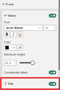
Customize the X-axis labels
The X-axis labels display below the columns in the chart. Right now, they're light grey, small, and difficult to read. Let's change that.
In the Visualizations pane, select Format (the paint brush icon
 ) to reveal the customization options.
Expand the X-axis options.

There are cases where you might want to set the X-axis Values to Off. For example, if the visualization is self-explanatory without labels or if you have a crowded report page and need to make space to display more data.
Format the x-axis text by adjusting these values:
- Font family: Select Arial Black
Format the text color, size, and font:
Color: Select black
Text size: Enter 14
Font family: Select Arial Black
Columns: Open Spacing
Inner padding: Enter 40%
Change the font size to something smaller than 14.
Make the visualization larger.
Display fewer columns and add a scrollbar by increasing Minimum category width.
Here, we selected the second option and grabbed one of the resize bars to make the visualization wider. It now accommodates the 14-point text without needing to display the text on an angle or with a scrollbar.

Customize the X-axis title
When the X-axis title is On, the X-axis title displays below the X-axis labels.
Start by turning the X-axis title to On.
The first thing you might notice is that your visualization now has a default X-axis title. In this case, it's FiscalMonth.
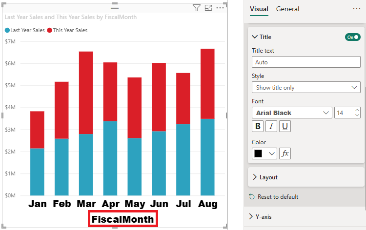
Format the title text color, size, and font:
- Title color: Select orange
- Axis title: Type Fiscal Month (with a space)
- Title text size: Enter 18
After you finish the customizations, your stacked column chart looks something like this:

Save your changes and move to the next section. If you ever need to revert all of the changes, select Revert to default at the bottom of the X-Axis customization pane. Next, let's customize the Y-Axis.
Customize the Y-axis
There are many features that can be customized for the Y-axis. You can add and modify the data labels, Y-axis title, and gridlines. For values, you can modify the display units, decimal places, axis range (minimum and maximum values), and intervals. And, for categories, you can modify the width, size, and padding of bars, columns, lines, and areas.
The following example continues our customization of a column chart. Let's make a few changes to get you familiar with the options, and then you can explore the rest on your own.
Customize the Y-axis labels
The Y-axis labels are displayed on the left side by default. Right now, they're light grey, small, and difficult to read. Let's change that.
Expand the Y-axis options and move the Values slider to On.

One reason you might want to turn off the Y-axis, is to save space for more data.
Format the y-axis text by adjusting these values:
- Font family: Select Arial Black
- Font size: Enter 10
- Color: Select black
- Text size: Enter 10
- Display units: Select Millions

Control the Y-axis range and intervals
You can control how many labels appear on the Y-axis by adjusting the axis range settings. This is useful when you want to show more or fewer data points on the axis.
In the Y-Axis options, expand the Range section.
To set custom minimum and maximum values:
- Set the Minimum value to define where the axis starts (e.g., 0)
- Set the Maximum value to define where the axis ends (e.g., 10000000)
By adjusting these values, you can control the scale of your axis and indirectly affect how many labels appear. Power BI automatically calculates optimal intervals based on the range you specify.
Note
Power BI automatically determines the best interval spacing for axis labels based on your data range. You cannot directly set a specific interval value (such as "show a label every 1000 units"), but you can influence label density by adjusting the minimum and maximum range values.
To reset the axis to automatic values, clear the Minimum and Maximum fields or select Revert to default at the bottom of the Y-Axis customization pane.
Customize the Y-axis title
When the Y-axis title is On, the Y-axis title displays next to the Y-axis labels. For this visualization, having a Y-axis title doesn't improve the visual, so leave Title turned Off. Later in this tutorial, we add Y-axis titles to a dual-axis visual.
Customize the gridlines
Let's make the gridlines stand out by changing the color and increasing the stroke:
- Expand The Gridlines Tab: Select Horizontal
- Color: Select orange
- Width: Enter 2
After all these customizations, your column chart should look something like this:

Customizing visualizations with dual Y axes
Some visualizations can benefit from having two Y axes. Combo charts are a good example. Before we can format dual Y axes, we need to create a combo chart that compares trends for sales and gross margin.
Create a chart with two Y-Axes
Select the column chart, and change it to a Line and stacked column chart. This type of visual supports a single line chart value and multiple stackable column values.

Drag Sales > Gross Margin Last Year % from your Fields pane into the Line Values bucket.

Reformat the visualization to remove the angled X-axis labels.

Power BI creates two Y axes, allowing the values to be scaled differently. The left axis measures sales dollars. The right axis measures gross margin percentage.
Format the second Y-Axis
Because we started with a visualization with one formatted Y-axis, Power BI created the second Y-axis using the same settings. But we can change that.
In the Visualizations pane, select the paint brush icon to display the format options.
Expand the secondary Y-Axis options.
Verify that it is On. Our secondary Y axis represents the line chart.

(Optional) Customize the font color, size, and display units for the two axes. If you switch Position for either the column axis or the line axis, then the two axes switch sides.
Add titles to both axes
With a visualization that's complex, it helps to add axes titles. Titles help your colleagues understand the story your visualization is telling.
Toggle Title to On for Y-Axis (Column) and the Y-Axis (Line).
Set Style to Show title only for both.

Your combo chart now shows dual axes, both with titles.

Format the titles. In this example, we shortened one of the titles and reduced the font size for both.
- Shortened the Title text for the first Y-axis (the column chart) to Sales last year & This year.
- Font size: 9

For more information, see Tips and tricks for color formatting in Power BI and Customize visualization titles, legends, and backgrounds.
Invert the y-axis
For line, bar, column, area, and combo charts, you can invert the y-axis, putting positive values going down and negative values going up.
In the Format visual pane, select Visual. Expand the Y-axis section, expand the Range section, and move the Invert range slider to On.

Considerations and limitations
- For continuous axes, Power BI automatically chooses the best tick interval based on your data range to ensure optimal readability. While you cannot set a specific interval value, you can influence the number of labels by adjusting the axis range (minimum and maximum values) in the Range section. Power BI creates a minimal format string for the tick interval to preserve space. Date values will be localized based on your system or browser locale.
Related content
More questions? Try the Power BI Community