Note
Access to this page requires authorization. You can try signing in or changing directories.
Access to this page requires authorization. You can try changing directories.
APPLIES TO: ![]() Power BI Desktop
Power BI Desktop ![]() Power BI service
Power BI service
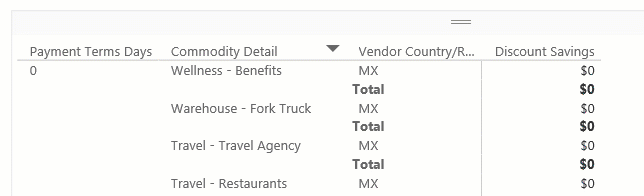
The matrix visual in Power BI is a powerful tool used to display and analyze data across multiple dimensions. Similar to a pivot table in Excel, the matrix visual allows you to organize data into rows and columns, making it easier to understand complex datasets. Each cell in the matrix represents a specific data point, with the ability to drill down into more detailed levels of information. This design facilitates a comprehensive view of data, enabling users to identify patterns and trends across various dimensions.
The matrix visual's ability to aggregate data and support hierarchical structures makes it an essential tool for in-depth data analysis and reporting. Matrix visuals are frequently employed in business and finance to analyze performance metrics, such as sales by region or product category. Additionally, they're valuable in marketing for examining customer behavior, campaign effectiveness, and market segmentation.
Prerequisites
- Always make sure you have the latest version of Power BI Desktop installed before proceeding.
- For the purposes of this guide, in Power BI Desktop's Global options, under the Preview features section, the On-object interaction feature is not enabled. In the following guide, we're using the Retail Analysis Sample PBIX file. After downloading the file, let's get started:
- Launch Power BI Desktop.
- On the left-side navigation pane, select Open, otherwise on the top-left of the window, select File > Open.
- Locate and select your copy of the Retail Analysis Sample PBIX file. The file will open in report view, ready for you to begin.
- Select the + icon at the bottom of the window to add a new page to the report.
Note
Sharing your report with a Power BI colleague requires that you both have an individual Power BI Pro license or that you have saved the report in Premium capacity.
Let's create a matrix visual
Before we begin, review the Prerequisites section at the beginning of this article, and follow the steps under the tab for Power BI Desktop.
In this quick and easy three-step guide, let's create a matrix visual starting from the Visualizations pane in Power BI Desktop.
From the Visualizations pane, first select the Build visual icon. Then select the Matrix visual icon, and a visual placeholder is immediately added to the report canvas.

To add data to the visual in this example, let's use the Data pane. Adding data can be done by selecting fields and measures, or dragging fields and measures to the field wells on the Visualizations pane, or dragging fields and measures directly to the visual placeholder in the report canvas. Expand the Sales group, to add TotalSales and then TotalSalesLY to the Values field well. Expand the Item subgroup, to add Category to the Columns field well. And finally, expand the Store subgroup to add Territory and then City to the Rows field well.

To customize your matrix visual, select the Format visual icon in the Visualizations pane, granting you access to all available settings, allowing you to tailor the matrix visual's appearance and functionality to your specific requirements.


Great job! Congratulations on successfully creating a matrix visual with Power BI. Next, take time to familiarize yourself with the comprehensive list of Matrix visual format settings and other related articles in the Related content section.
Work with the matrix
Expand and collapse row headers
Use expand and collapse icons provided to combine groups or to show more detail.

Freeze row headers
By default row headers are frozen, which ensures they stay visible when you scroll horizontally.

To unfreeze row headers, and therefore hide them as you scroll horizontally, right-click on the row headers and select Unfreeze row headers.

To refreeze the row headers, right-click on the row headers again and select Freeze row headers.
Adjust column width
Column width in Power BI tables and matrices can be adjusted to improve readability and presentation. You can manually resize columns or use automatic options to optimize how your data appears in the report.
Manual adjustment
Sometimes Power BI shortens a column heading in a report or dashboard. To display the full column name, you can resize the column in two ways:
Resize by dragging
Move to the space just to the right of the column heading until the resize arrows appear. Once the arrows are visible, adjust the column width by moving the resize handle left or right.
Resize using menu options
Select the column you want to adjust. From the available options, choose Widen column or Narrow column to change its width by 10px.
Automatic adjustment
Power BI can also automatically adjust column sizes for you.
Two options are available:
- Fit to content: Makes the columns as wide as they need to be to show the data, assuming there's room in the visual container.
- Grow to fit: Automatically expands your columns to fill the visual container for a more balanced layout. When Grow to fit is enabled, any leftover horizontal space is distributed evenly to each column.
Note
Columns that were manually resized aren't changed by the Autosize width option.
The manual resize and Autosize width (fitting to content) options size each column to its contents, but you might still have some unused space in the visual container:

The Grow to fit feature automatically expands your columns to fill the visual container for a more balanced layout. When Grow to fit is enabled, any leftover horizontal space is distributed evenly to each column:

To enable Grow to fit:
- Select the table visual.
- Open the Format pane.
- Expand Column headers, then expand Options.
- Toggle Autosize width to On.
- From the Resize behavior dropdown, select Grow to fit.

Note
Columns that were manually resized don't change.