Note
Access to this page requires authorization. You can try signing in or changing directories.
Access to this page requires authorization. You can try changing directories.
The Analytics page in Copilot Studio provides an aggregated insight into the overall effectiveness of your agent across analytics sessions. The page is divided into core areas that focus on different performance contexts. The page also displays an Overview area that provides high-level, key performance indicator (KPI) metrics for your agent, a Savings area that analyzes time and cost savings attributable to your agent or your agent's tools, and a Summary area that provides key analytic insights into your agent's performance.
For more information about:
- The Summary and Overview areas, see Analytics overview
- The Savings area, see Analyze time and cost savings for agents
There are six core areas to focus on when reviewing and improving conversational agent effectiveness:
- Themes: Themes help you gain analytics insights by clustering user questions into AI-suggested categories.
- Conversation outcomes: Knowing the end result of a conversation helps you begin to identify where your agent is succeeding and where it needs improvement.
- Agents: See call volume metrics, success rates, and current status for child and connected agents.
- Generated answer rate and quality: Understanding when agent struggles to provide answers to user questions and how it uses knowledge sources can help you find ways to improve your agent's answer rate and quality.
- Tool use: Learning how often tools are used and how often they succeed can help you understand if those tools are useful and successful for users.
- Satisfaction: Reviewing user feedback helps you identify new user scenarios and issues, and making improvements based directly on what your users are asking for.
You can view analytics for events that occurred in the last 90 days.
Conversation outcomes
The Conversation outcomes section shows a chart that tracks the type of outcome for each session between your agent and users.

The chart, whether displayed as a stacked histogram or stacked area chart, visualizes the relative volumes of outcomes, color-coded and stacked by type. Each of Resolved, Escalated, Abandoned, and Unengaged are represented by their respective colors for each data point. The y-axis indicates the number of sessions.
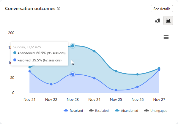
To see metrics about individual outcomes specific to one data point (a specific day), hover over an area representing the color of an outcome of interest (for example, teal for Abandoned) on the day you're interested in. In the example, there were 90 abandoned sessions representing 35.6% of all session outcomes on November 24.

In the legend below the chart, hover over any of the outcome labels to highlight that outcome in the chart.
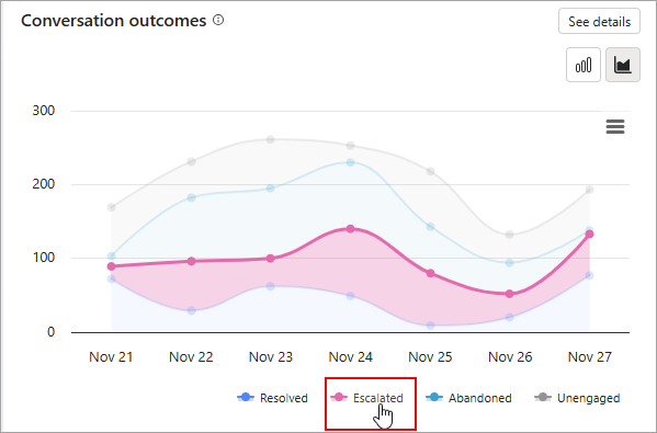
Select (on or off) one or several of the legend labels to either show or hide outcomes from the stacked area chart. Do this to add more clarity to the outcomes that remain when:
- Individual outcome lines appear visually close together.
- You want to see more clearly when trend lines are trending positive or negative but the aggregate of stacked outcomes on the chart is flattening these trend lines.
Note
When you remove an outcome from the chart in this way, you remove that outcome from the larger pool of displayed outcomes. Removing displayed outcomes changes the displayed percent value of any remaining outcome against the pool because it changes the denominator of the ratio.
In the following example, the Escalated and Unengaged labels were removed from the chart. The tooltip shows there were 95 abandoned sessions on November 23, which represents 60.5% of the remaining visible outcomes on the chart (being the sum of Resolved + Abandoned outcomes).
To download conversation outcome data (data visualized in the graph), select the menu icon ![]() and select Download CSV.
and select Download CSV.
Note
If you have any outcomes removed from the chart when you download, their data doesn't appear in the CSV.
To open a side panel with detailed information about conversation outcomes, select See details on the chart. The Conversation outcomes side panel includes:
- A pie chart breakdown of session outcomes, showing relative weighting (expressed as a percent) of Resolved, Escalated, and Abandoned outcomes.
- A stacked bar graph showing the relative weighting (expressed as a percent) of Resolved confirmed and Resolved implied outcome reasons describing all resolved session outcomes.
- A stacked bar graph showing the relative weighting (expressed as a percent) of System intended, System unintended, and User requested outcome reasons describing all escalated session outcomes.
- The top topics that led to each outcome.
Note
To see a tooltip with raw count information, hover over any of the pie chart or stacked bar chart segments.

A session falls into one of the following two states:
Unengaged: A session starts when a user interacts with your agent or the agent sends a proactive message to the user. The session begins in an unengaged state.
Engaged: The user actively interacts with the agent. There's a difference in behavior based on the agent's orchestration mode.
Classic orchestration: A session becomes engaged when one of the following topics is triggered:
- Custom topic directly triggered by the user
- Escalate topic
- Fallback topic
- Conversational boosting topic
Generative AI orchestration: A session becomes engaged when a user directly triggers a plan and includes one of the following elements:
- Nonsystem topic
- Escalate topic
- Fallback topic
- A Knowledge Source
- A tool
An engaged session has one of the following outcomes:
| Outcome category | Outcome | Description |
|---|---|---|
| Resolved | A session ends successfully. There are two types of resolved sessions: Resolved confirmed and Resolved implied. | |
| Resolved confirmed | A session is considered Resolved confirmed when the End of Conversation topic is triggered and the user confirms that the interaction was a success. | |
| Resolved implied | A session is Resolved implied when the session is completed without user confirmation but instead based on the agent's logic. The Resolved implied state depends on whether your agent uses Classic or Generative AI orchestration: - Classic orchestration: A session is considered Resolved implied when the End of Conversation topic is triggered, and the user lets the session time out without providing a confirmation. - Generative AI orchestration: A session is considered Resolved implied when a session times out and there are no remaining active plans. An active plan is a plan that's waiting for a user's input. |
|
| Escalated | A session ends but is considered Escalated when the Escalate topic is triggered or a Transfer to agent node is run (the current analytics session ends, whether the conversation transfers to a live agent or not). There are three types of escalated sessions: System intended, System unintended, and User requested. | |
| System intended | A session is escalated automatically as a result of an automatic business rule set by a maker. The escalation is an expected outcome of the conversation and is not something needing investigation or change. Example: A user would like to transfer more than $25,000 to a third party. This amount exceeds a threshold in a business rule and the session is automatically escalated as a result. |
|
| System unintended | An escalation occurs automatically as a result of a session exceeding one or more thresholds set by a maker. Usually, this indicates that the user is stuck in the conversation and needs assistance. Example: A session is escalated after three failures to do a particular task. |
|
| User requested | A session is escalated because there was an explicit user request during the conversation. Example: A user enters |
|
| Abandoned | A session ends and is considered Abandoned when an engaged session times out after 30 minutes and didn't reach a resolved or escalated state. |
You can also set the outcome for tools with the conversationOutcome parameter using the tool code editor. For example, conversationOutcome: ResolvedConfirmed for confirmed success or conversationOutcome: ResolvedImplied for implied success.
See the guidance documentation on measuring engagement for suggestions and best practices on how to measure and improve engagement.
Agents
The Agents list displays high-level volume, performance, and status metrics for connected and child agents of your main agent. The list identifies the relationship type the listed agent has to your main agent in the Type column. If an agent is a child agent, its type is Child. Connected agents have a listed type that reflects where they were created (for example, Copilot Studio, Azure AI Foundry). The Calls metric for each listed agent describes the volume of calls from the main agent to the connected or child agent. Success rate reflects the proportion of calls (as a % of all calls) that completed successfully. Status indicates the individual administrative status for each connected and child agent.
By default, the Agents list displays the top five (5) connected and child agents of your main agent, ranked from highest to lowest total number of questions. If there are more than five agents, select See all to display all agents.
Note
The See all button is visible only if there are more than five connected or child agents to your main agent.

Generated answer rate and quality (preview)
Important
This article contains Microsoft Copilot Studio preview documentation and is subject to change.
Preview features aren't meant for production use and may have restricted functionality. These features are available before an official release so that you can get early access and provide feedback.
If you're building a production-ready agent, see Microsoft Copilot Studio Overview.
With generative answers, your agent can use AI to generate answers to user queries using knowledge sources and the instructions you provide. However, your agent might not be able to answer all user queries. The Generated answer rate and quality section tracks, organizes, and analyzes unanswered queries and answer quality to give you guidance for improving your agent's answering performance.

The Answer rate shows the number of answered and unanswered questions within the selected time period and the percentage change over time.
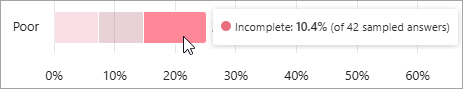
Answer quality measures the quality of answers using AI. Copilot Studio looks at a sample set of answered question and analyzes different quality, including completeness, relevance, and level of groundedness of a response. If the answer meets a set standard, Copilot Studio labels the answer as Good quality. Copilot Studio labels answers that don't meet that standard as Poor quality. For Poor answers, Copilot Studio assigns a reason for the quality rating, and shows the percentage of answers assigned to each category.
Hover over any segment of a bar in the chart to see the relative weighting of an individual reason for either a Good or Poor quality label. The tooltip also indicates the number of answers sampled to arrive at the calculated percent value.
In the legend below the chart, hover over any of the quality label reasons to highlight that reason in the chart.

You can provide feedback to Microsoft about this section with the Thumbs up and Thumbs down icons  . Use the Submit feedback to Microsoft panel to add a comment and share related files. By providing descriptive feedback like this, we can work together to continuously improve our product.
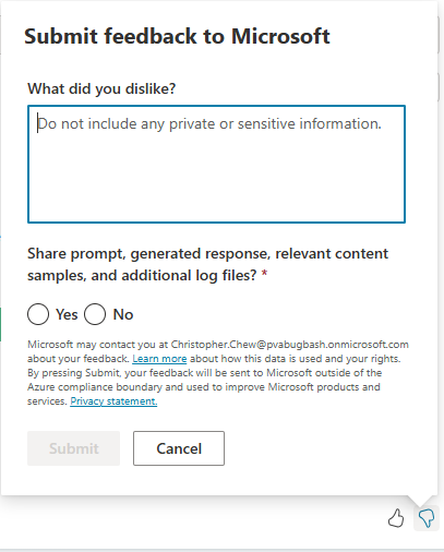
- On the Submit feedback to Microsoft panel, describe in natural language your likes or dislikes, depending on which icon you selected to open the panel.
- Choose whether to share prompt, generated response, relevant content samples, and additional log files.
- Select Submit.
Select See details to open a side panel with question answer rates, knowledge source usage, and error rates over your selected time period. You can use these charts to identify which knowledge sources work well to help users, and which to target for improvements.
If your agent has child agents, on the side panel, select All to display metrics for both the main agent and child agents, Main agent for metrics about the main agent only, or Child agent for metrics about child agents only.
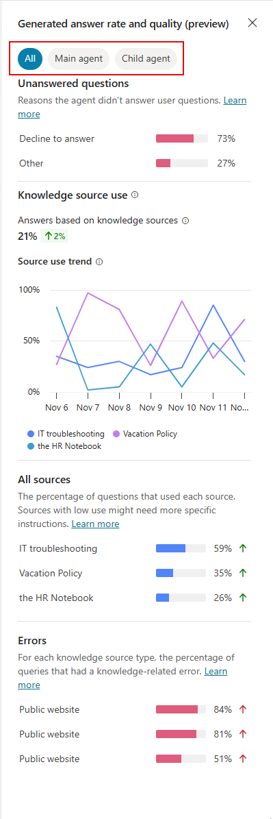
- Unanswered questions shows the reasons why the agent didn't answer a user query.
- Knowledge source use shows the percentage of sessions that used each knowledge source the agent has access to.
- All sources shows the percentage of questions that used each knowledge source.
- Errors shows the percentage of queries that resulted in a knowledge-related error for each knowledge source type (for example, SharePoint).
Under All sources, to see more information at the level of any one of the listed knowledge sources, select an individual source. The tooltip includes:
- The total number of questions that referenced this knowledge source as well as the number of thumbs up and thumbs down reactions.
- A stacked bar chart showing the breakdown of the quality of response relative weightings for questions referencing this knowledge source. Hover over any segment of the bar chart to see the value of that segment's relative weighting and the number of questions sampled to arrive at that value.

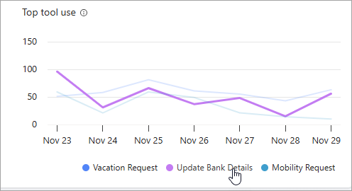
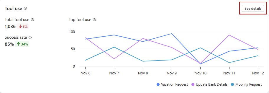
Tool use
The Tool use section shows a chart and metrics that track how often your tools are started over time, and how often your agent used those tools successfully. It also shows trend indicators for how often your agent uses each tool and the percentage of called tools used successfully.
The chart displays the top five tools used over the date period defined at the top of the Analytics page.
In the legend below the chart, hover over any of the tools to highlight that tool in the chart.
To open a side panel with a list of all tools used in the specified time period, along with trend indicators, select See details on the chart. On the Tool use panel, you can display calculations of the percentage of questions used for each tool. If your agent has child agents, you can choose to display calculations for both the main agent and child agents (All), the Main agent only, or the Child agent only.

Satisfaction
The Satisfaction section shows user feedback gathered from reactions to agent responses and survey results for a session. Satisfaction is split into two smaller sections: a Reactions section, which displays thumbs up, thumbs down feedback for specific agent responses, and a Survey results section, which displays the customer satisfaction (CSAT) score for the entire session.
Feedback data is stored in the conversation transcript table in Dataverse. For a list of channels that support this feature, see Feature details.
Reactions
The Reactions section shows user feedback gathered from reactions to agent responses and survey results for a session. The chart counts the number of times users selected either the thumbs up (positive) or thumbs down (negative) buttons available on each response they received from your agent.
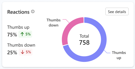
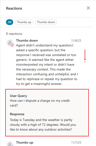
After a user provides a reaction, they can leave a comment. To view comments, select See details. On the Reactions panel, select All, Thumbs up, or Thumbs down to filter comments.
Note
- Agents published to the Microsoft 365 Copilot channel don't support reactions.
- To view comments, you must have the Bot Transcript Viewer security role.
For each reaction, to see the associated user query and agent response, select the toggle beside the comment. The Analytics page stores user queries and agent responses for up to 28 days.
User feedback is On by default. You can turn off this feature, if desired. You can also add or edit a disclaimer for users about how their feedback is used:
Open the agent, then go to Settings, and find the User feedback section.
Turn Let users give feedback when using this agent either On or Off.
Add or edit a disclaimer so users know how their feedback is used. You can also provide privacy information and tips.
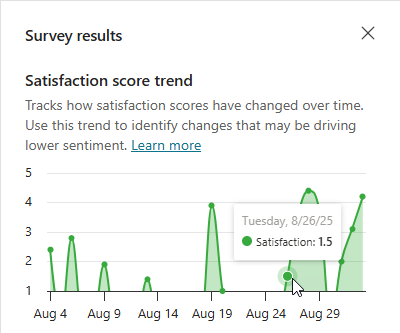
Survey results
The Survey results section shows a chart and metrics that track the average customer satisfaction (CSAT) scores for sessions in which customers respond to an end-of-session request to take a survey.
Note
Scores of 1 and 2 map to Dissatisfied, a score of 3 is considered Neutral, and scores of 4 and 5 map to Satisfied.

Select See details to see how the satisfaction score trends over the report's configured time period.